I met Dr. Lawrence Preuss several years ago, when I replied to a question about the location of a Swiss hotel that he had put on some talk area about travel and traveling. He was then beginning a collection of labels and I had not yet written my first article on the matter. A few months later he acquired a small group of labels that were someone's mementos of a trip to Europe in the 1930s. I congratulated him on a rare version of the Richter label for the Hotel Flora, in Rome, which I had not seen before. A few days later I found the label in my mailbox with his compliments. Such grand gesture, heard of through the classical writings of Greek and Latin authors of Old but never witnessed in our time, did not fail to impress me. And when I met the man, I found without surprise that Larry was indeed equal to the gesture, and with a sense of humor on the side.
When I thought of doing virtual exhibits of labels that will be uploaded for three months only, I asked Larry permission to do the first on his collection. I therefore chose 20 labels that I found extraordinary for one reason or the other and offer them today to you with my explanation of why they have caught my eye. Enjoy!
Joao-Manuel Mimoso (2003,September 20)
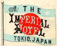
This label is the earliest I have seen of the fabled Tokyo Imperial. You may view most of the more recent designs in another of my pages
It was in use around 1904, but may be older by several years. The "flag-labels" of this type were favored in Japan until around 1920 and are a rather common design. But this particular label is rare and is indeed one of the prettiest examples of the Japanese flag-label.
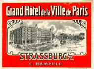
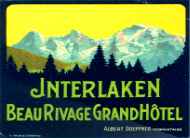
Before the rebuilding of the Hotel Maison Rouge, in the early XX century, the Ville de Paris was the most imposing hotel in Strasbourg.
Notice that the name of the village (Strassburg i/E, meaning "Strassburg im Elsass") is written in German. That is because Alsace-Lorraine was German territory from 1870 until 1918 and the fact that this label is from that period gives it historical meaning.
|
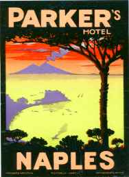
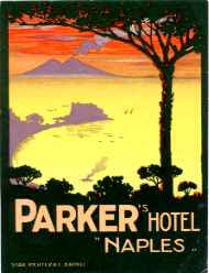
This label is a superb design by Richter's artists. The earliest version is circa 1910 (right side, from my own collection). If you examine it closely you will find that the lower lettering unbalances the design and the artist's attempt at a solution by using lighter types did not help. On Larry's label at left (circa 1920s) the problem has been solved. Those of you who said "I got that one" look again: most issues of this design name the hotel "Parker's Britannico" or "Parker's Britanique". I had never seen the version in Larry's collection before! |

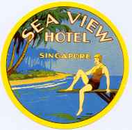
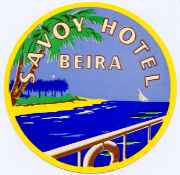
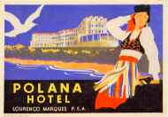
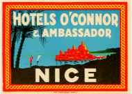
The unusual label at left is interesting for the location of the hotel and for depicting a bather in period attire.
But also because it was considered worthy of imitation in Portuguese Mozambique ( see the uninspired label at right, from my own collection).
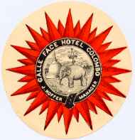
This exceptional label is the kind that other collectors pass and I pick for a trifle in the "10 cent box" of paper dealers.
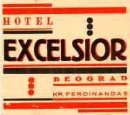
It is a very rare example of the red/black avant-garde graphics that were favored by the Bauhaus students. It is also the very best I have seen!
The fact that it comes from a Balkanic country that is rarely represented in old collections is a sort of gift on the side.
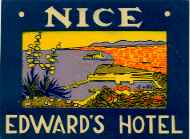
By the late 1890s gifted French and Swiss poster designers were experimenting in color when doing landscapes. They soon found that the waters of the large alpine lakes of Switzerland and France looked much more attractive in yellow or rose against green skies, than in more natural colors.
This label may seem rather modern but it certainly is not. It can be dated to before the First World War and is the result of one of those experiments that went, er... a bit too far. It may not be pretty but is highly unusual and at least its electric green was sure to grant the attention of passers-by for that brief moment when a label on a suitcase could catch the eye of onlookers. And, after all, that was its main purpose!


This label was chosen to stress a point: labels with only lettering may also be desirable!
Italian Futurism, as did Art Nouveau before it, prized hand-drawn letter types of great diversity. Here we have an example of the attractiveness that can be drawn from creative letter shapes and the use of proper colors.
 |
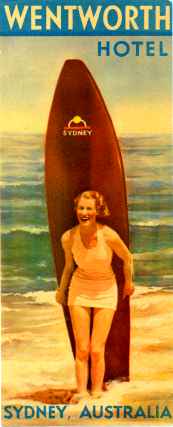
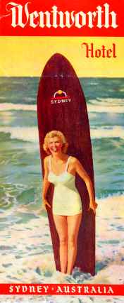
| Finally, I chose the label at near right. This was still another occasion when I thought I had a copy of the label myself, but something seemed different. When I fetched my copy (at far right) I confirmed that they were two entirely different labels, of which Larry's version is certainly the oldest. The fact that there are at least two, makes them all the more desirable... but I wonder why they found it necessary to reshoot? Was it to change the shape of the board? Or the girl? |
|
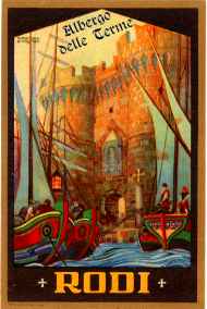
The label at left has everything for it: good graphics (signed by Florestano Di Fausto); a good printer (Stab. Salomone, in Rome); and historical meaning. In fact, the island of Rhodes was part of the Ottoman Empire, after WW I became an Italian possession, and finally became Greek as a result of WW II. This label represents its Italian Period.
|
||
| . | ||
|
This page was done on Dreamweaver 3 for Explorer.
This page will be deleted on a count to three: 1; 2; ...