A short history
of hotel luggage labels- 3
The Second Golden Age and after (1920- )
by Joao-Manuel
Mimoso
|
|
|
In the wake of the Armistice
that put an end to the First World War, individuals as well as nations
were trying to find their bearings again. So were hotel owners,
who started reopening to an uncertain demand, and graphic artists
who were once again called to design promotional paper items. Art
Nouveau, a somewhat tiresome and often over-decorated style, had
started to subside soon after its triumph in the 1900 Paris Universal
Exhibition. By 1905 Paris was over with it, and the rest of the
world soon followed. But not all trends that fitted under the broad
umbrella of Art Nouveau were curvaceous or over-decorated. The so-called
"Glasgow Four" in Scotland, the Austrian members of the Wiener Werkstätte,
and others took inspiration in such sources as the minimalist classical
Japanese interiors and the clean aesthetic of machine-made products
to advocate the design based on tall, rectilinear forms and sharply
defined angles.
|
|
 |
|
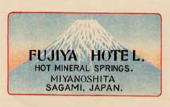
The
Japanese label above dates from circa 1910 and illustrates
the fine classical Japanese graphic style that was emulated
in the West.
|
|
|
| The demise of Art Nouveau
had seen, for some, a fallback to the old graphic solutions and for
others a quest for new aesthetics. This would eventually lead to a
new global style called Style Moderne in its heyday and known
today as Art Deco (or simply "Deco"), a name coined in the 1960s after
the Exposition des Arts Decoratifs that was held in
Paris in 1925. Graphically, Art Deco is characterized by an emphasis
on striking geometric shapes and patterns, often in bright contrasting
colors, and rectilinear typefaces with clearly defined angles. Although
the style only became truly international after the 1925 exhibition,
it had been brewing for many years and there are designs clearly identifiable
as deco datable to before 1920. In hotel labels, the post-WW I period
had been a time of reuse of old design solutions (and often reissue
of unchanged designs from prewar times). There were still marvelous
labels, but nothing really novel that could match the revolution of
the early 1900s... then came Deco, originating a string of stupendous
new designs and a rekindling of the Golden Age. Beholding those
labels today, one feels surprised that, once, so much talent was routinely
lavished on such small and seemingly unimportant pieces of graphic
work. |
|
|
|
| The label above,
for a Palace-Hotel in the French spa of Vittel illustrates some of
the main traits of the fine French deco: bold colors, elongated figures
and angled shapes. The lettering (characteristically made of non-seriffed
angled fonts) was an essential part of the design. |
|
| France, that had neither
lead, nor been lead during the First Golden Age, now dictated the
trends and produced some of the best labels ever to grace a traveler's
luggage. Switzerland barely managed to hold its ground in innovative
graphics thanks, mostly, to the designs of Brügger's artists. Italy,
on the other side, was again a source of great decorative originality,
but Richter
& Co was no longer its motor. Mario
Borgoni was aging and never really caught with the new style (the
fine label at right is a rare attempt at deco-inspired design). He
was still Richter's artistic director and probably imposed his own
by then conservative standards to others. J. Paschal still designed
labels but he too seems to have lost the gaiety of twenty years before.
Surely not all clients were delighted with the new trends, anyway,
and that may have justified Borgoni. He would leave Richter in 1930,
perhaps as a result of the dwindling demand that followed the 1929
Wall Street crash that would almost lead the luxury hotel business
to extinction. As Richter's entry into the label printing business
in 1900 had conveniently marked the beginning of the Golden Age of
Hotel Labels, so may Borgoni's year of departure conveniently mark
its finale! |
|
|
| Mario Borgoni's departure
was not, of course, the reason for the ending of an era; the Wall
Street crash of October 1929 was! It came at the end of the month,
when the European hotels were already open for the winter season in
a clime of prevailing optimism. Rooms were sold out in advance and
the recession did not start to really hurt the business until 1930,
when the trouble deepened. Then it became clear that what was happening
in the USA was not a short term local disruption and its consequences
spread throughout the world. Investment in luxury hotels had been
considered safe and prompt in bringing sizable returns but now the
developed countries sunk into a deepening economic recession, from
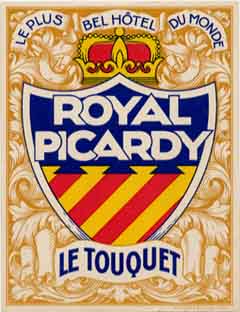
which no recovery was in sight. The tale of the unfortunate Royal
Picardy illustrates the fate of untimely investments in the field.
The hotel opened in the spring of 1929 at the French Atlantic resort
of Le Touquet. Its target was the wealth of Britain and no expense
was spared to entice it. It opened with 500 rooms and was deemed "Le
plus bel hôtel du monde" (The most beautiful hotel in the
world). One year later the company was on the verge of bankruptcy.
Eventually the hotel was remodeled and opened with only 60 rooms...
(the agony finally ended in 1970 when the once proud building was
demolished). |
|
|
|
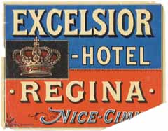
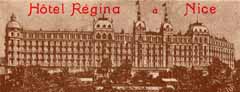
The French luxury hôtellerie
was possibly hit the hardest by the recession. The heights of Cimiez,
above Nice, held one of the largest concentration of luxury hotels
in the Cote d'Azur. Its crown was the peerless Regina, once patronized
by Queen Victoria herself and one of the largest and most luxurious
hotels in the world. In 1934 the owning society was bankrupt. A
few months later the wine cellar and furniture were auctioned. In
1937 the hotel was transformed into a condominium. Its long and
graceful building still gazes sadly towards Nice. Its neighbors
(the Majestic, the Alhambra, the Riviera and the Winter-Palace)
suffered the same fate during the 1930s. Of the fabled French palace-hotels
of Menton, Grasse, Aix-les-Bains or Vichy none remains today! During
the 1930s the palace-hotel owners that still resisted could no longer
spend lavishly in paper items that would mark their difference.
Now they had to count their pennies and consequently labels tended
to be cheap and were cheaply printed, frequently bad copies of older
designs. New labels were often somber, as if prophesying the war
that was soon to come.
|
|
|
|
In 1936 French workers
were allowed paid summer vacations for the first time. Other countries
soon followed. The tourism business took off again but the demand
was now for cheap lodgings, not expensive ones. Yet, the new breed
of travelers also fancied to emblazon their luggage
By then, all
hotel owners had realized that there was promotion potential in
having the name of their hotels on the luggage of customers and
after WW2 labels would be produced in a number and variety never
seen before. Every hotel and boarding house had its own label, often
in sets of different colors. Some of these designs are interesting
for their naïveté (see label at right). There were still some good
artistic designs, particularly for hotels in faraway places, visited
by a more exclusive élite, but these were rare and getting rarer.
|
|
|
|
Expensive printers serving
the hotel industry had, meanwhile, diversified or disappeared. By
the early 1950s even Richter was gone, after producing some postwar
editions, often based on photographs, that in no way hinted to its
former grandeur. The vulgarization of air travel during the 1970s
finally brought the production of hotel labels to a halt: the rough
handling of luggage that characterizes mass travel by air meant
that labels would be all but destroyed after only a few flights.
Nowadays, a few hotels still offer self-adhesive stickers to their
customers, but the designs cannot compare with their illustrious
predecessors. The age of the hotel label is a thing of the past
but, with time, these small rectangles and circles of colored paper
came to represent an era. They irresistibly summon nostalgic feelings
for times most of us never knew but, somehow, would like to have
experienced.
|
|
|
|
|
Lisbon, Portugal
-
uploaded:
Jan. 30, 2003
-
last reviewed:________
|
| |
|