Erik Nitsche was born in 1908 in Lausanne, Switzerland. He studied and was trained in his home country and in Germany (where he became familiar with the Bauhaus principles of styling) before settling in Paris in 1931.
He was soon hired by Maximilien Vox to work for "Le Service Typographique", a local printing and design business. Among his many assignments he designed the graphics for the Transatlantique group of hotels in French North Africa- letterheads, menus and (you guessed!) luggage labels.
Maximilien Vox, his employer, was also a prolific writer on matters related to design and typography thanks to what we now have data on Nitsche's work in this rarely mentioned field.
Nitsche's labels show a distinctive deco styling but frequently lack in the elegance of his later poster work (the artist himself would one day reminisce on how he learnt the subtleties of elegant styling during his Parisian years).
In 1934 Nitsche left for the United States where he would do covers and artwork for many of the top American fashion and decoration magazines. In 1955 he was fortunate to be awarded a contract by General Dynamics for which he designed a set of posters that made him known to the general public- but I digress...

Most (but not all) of the circa 20 hotel luggage labels designed by Nitsche bear, either his signature ("Erik Nitsche"), or his monogram (a tilted "N"). All those I know of are for hotels of the same chain in French Algeria, Tunisia or Morocco, but there may well be others that I have never seen.
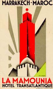
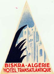
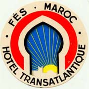
This article is illustrated by a selection of 10 of Nitsche's labels by which the varying quality of his early work may be asserted. The prize of the set is, in my opinion, the brilliant design for the Hotel de la Mamounia (Transatlantique) in Marrakech. Unfortunately this label is quite rare.
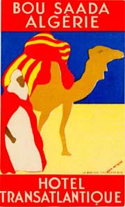
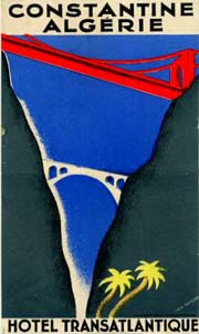
Other worthy designs are those for the hotels of the chain in Bou-Saada, Constantine and El-Golea (the last one being the rarer of the three).
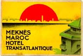
The label for the hotel in Meknes (see bottom of this article) is different from the others in several respects and may well represent an early effort. The excessive yellow areas and the lack of a strong central motif make it a notoriously uninteresting label.
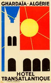
The label design for the hotel in Ghardaia, at right, is also (in my opinion) a failed attempt on account of the excessive squareness of the simplified building which the stylized sun does not quite compensate for.
Nitsche who, unfortunately, passed away in November 1998 did, in time, become a well-known, appreciated and influential modernist graphic artist and designer. But his reputation derives, in a great measure, from his work in the US (where there seems to be a fascination for European expatriate artists) and it is likely that he would not be widely known today had he made a career in his homeland.
His luggage labels are an example of the early work of a young artist and he cannot, thus, be judged by them. Yet, there is an undeniable appeal in their Art Deco styling because it is so readily recognizable. The fact that a whole series of altogether different designs exists, all part of the same set, is another strong point for the collector and a good reason for everyone to go sniffing around for Nitsche's labels and thus make it impossible for me to ever be able to complete a whole set. C'est la vie!
Credits:
Thanks to David Levine for bringing this artist to my attention and for data on his work.
David has a superb group of pages on the graphics of travel advertising which I will never be able to equal.
Other pages on the artist:
-this is the most comprehensive biographical page

- uploaded Oct. 29, 2002
- reviewed July 06, 2003.