HOTEL LABEL ARTISTS
AMERICAN ILLUSTRATOR DANIEL C. SWEENEY
by Joao-Manuel Mimoso
|
I have always prized the work of illustrators because they cannot fake talent. Traditionally they worked for magazine editors or for printers who often considered them as easily replaceable suppliers without enough individuality in style to make a difference. And these employers could not be tricked into taking cat for rabbit under the cover of a so-said "individual artistic style". Whatever the subject it had to be rendered in perfect proportions and with eye appeal to match, or else... Many illustrators were gifted artists who, nevertheless, were all but forgotten upon their deaths. People today do not recognize their names and, in fact, whenever they did not sign their work their existence as artists is entirely obliterated. And, when auctioned, their sometimes magnificent masterworks are now listed under the degrading heading "anonymous posters". |
|
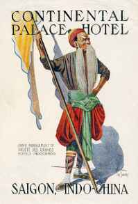
Dan Sweeney was a remarkable illustrator who, fortunately, signed his work and in his lifetime obtained enough recognition to be mentioned today in a few "Who is who in Art" books. Yet, as far as I know, his work has never been collected in a monograph, however short it might be. So, readers, this unpretentious effort may well be a first! Dan Sweeney was born in 1880 in Sacramento, California. Details of his early years are unknown but he must have started at illustration around the turn of the century. By 1914 he was already sufficiently known to be hired to illustrate a book but most of his work as a book illustrator seems to have been done in the late 1930s and early 1940s. |
|
Most of Dan Sweeney's illustrations were done for newspapers and magazines as the San Francisco Chronicle, Collier's, Overboard Monthly, World Traveler and others. He also did theater and travel posters and other illustrations. He was considered a specialist in western and marine subjects. And this brings us to his work in labels. Apparently his illustrations of exotic scenes caught the eye of a manager of the Hong-Kong & Shanghai Hotels concern and he was commissioned to design labels for the several hotels of the group in Hong-Kong, Shanghai and Peking. His commission may have been received during a trip to the Orient because he did labels for a number of other Asian hotels, all datable to a short period in the late 1920s. |
 |
|
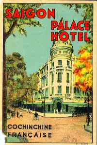
This
label for the Saigon Palace Hotel has all the characteristics
of a Sweeney label except the type used for the name of the hotel.
Also, there is a suspicious smudge in the foreground that might
result from the erasing of his signature... Was this made after
a Dan Sweeney illustration? Or is it just an imitation done for
a hotel owner envious of the Continental Palace's superior label?
|
|
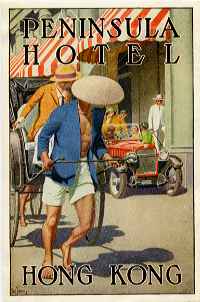
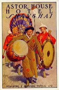
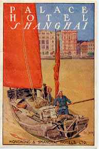
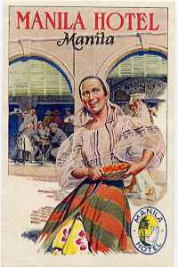
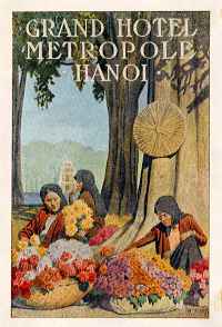
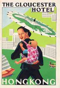
I know of 11 labels signed by Dan Sweeney for the following hotels: Hong-Kong Hotel; The Peak Hotel, HK; Peninsula Hotel, HK; Repulse Bay Hotel, HK; Grand Hotel des Wagons-Lits, Peking; Astor House, Shanghai; Majestic Hotel, Shanghai; Palace Hotel, Shanghai; Grand Hotel Metropole, Hanoi; Continental Palace Hotel, Saigon; and Manila Hotel (to me, his best label). They all share the same general dimensions (9X14 cm), they all have the name of the hotel in a serifed type of the Times News Roman family, and they are all printed by the four-color process on a variety of papers including a granular sort that offers the best color rendition. The same illustrations used for labels were used in publicity folders, cards (the same size as labels but printed on heavier stock) and postcards. Dan Sweeney died in 1958 but his fine labels remain. In their time they were amidst the finest on travelers' luggage and because of their appeal were widely imitated (e g: Gloucester Hotel in HK, Saigon Palace Hotel, and several others). Some of these labels may even stem from original designs by Dan Sweeney for these same hotels, that I have not seen yet. Actually chances are that my list is not complete, which makes the quest all the more interesting! |
 |
|
This
label, for the Gloucester Hotel in Hong Kong, goes to the point
of using the same sort of types as did Sweeney in his classical
designs. But it lacks the ease of rendering of the human figure
and the superior treatment of background details. Very likely
it is just a not very successful attempt at the elusive Sweeney
style.
|